Redesigning a website is a big undertaking, but it’s absolutely critical for home builders to stay up to date on UX design trends, user preferences, and performance standards in order for their websites to do their #1 job — convert visitors to leads. Our recommendation is to refresh your site continuously based on performance and goals, and to consider a complete website redesign every 3-5 years to keep up with changes in real estate technology and back end programming.
When DeLuca Homes came to us for help with a new website, they didn’t know exactly what changes needed to be made; they only knew what wasn’t working (which is the most important first step!). The site was a few years old, and it was outdated. It was also not so easy to navigate, as heat maps and other reporting tools were showing that users were clicking multiple times to get to the most important information. As a result, the site had a higher than desired Bounce Rate. The backend of the site was also difficult to use and not organized very intuitively.
So our web development team got to work! After a thorough website audit and careful consideration of DeLuca’s wish list and priorities, we put forth our recommendations, then developed and implemented a brand new website to address the challenges posed by the old one. Here are the main challenges the site faced, the solutions presented in the redesign, and why they work:
The Challenge: Tell the DeLuca Story
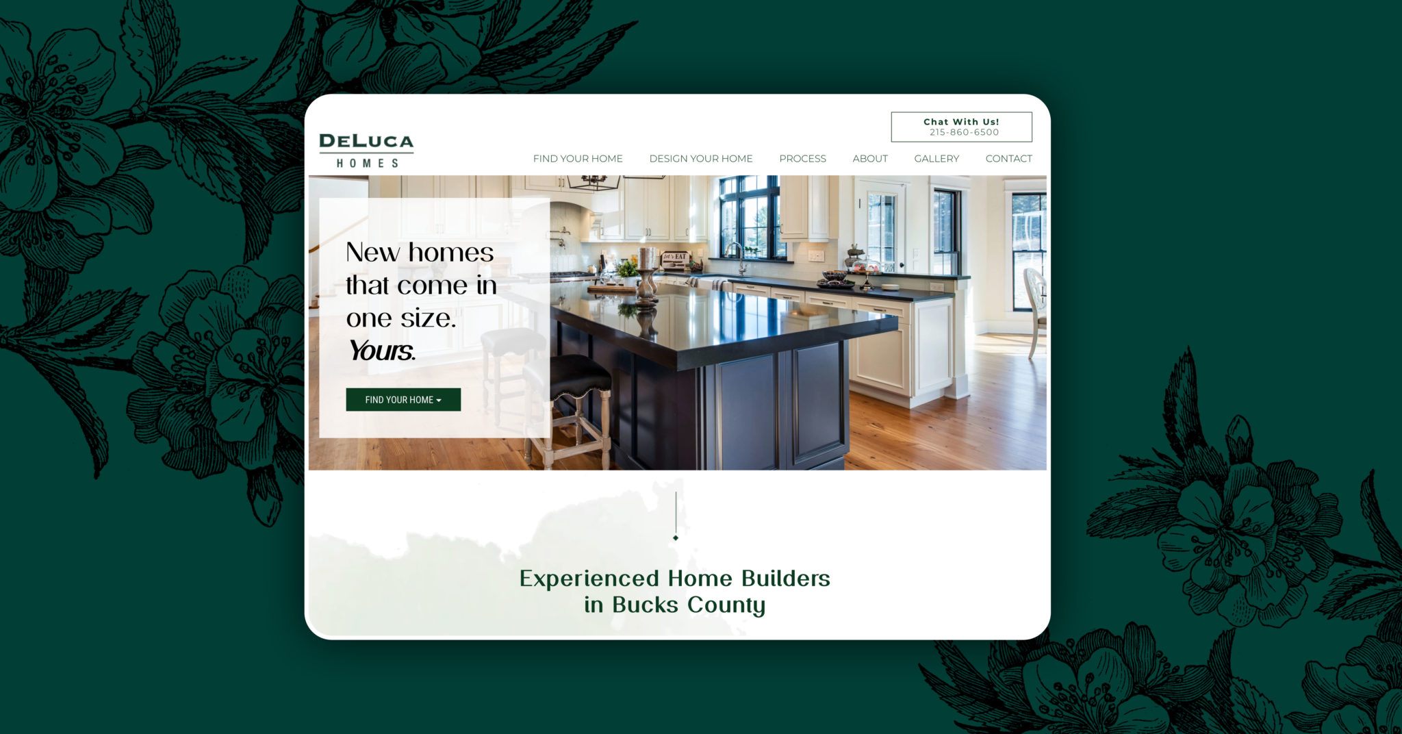
DeLuca Homes occupies a unique place in the Bucks County, PA market. The family-owned company has been in business for 50 years, and the DeLuca name is synonymous with beautifully constructed, quality homes in the area. Some customers have even bought multiple homes from them as they transitioned growing families to aging in place. The website did a fine job of displaying DeLuca’s communities and homes, but did not convey the company’s story, heritage, years of experience, and overall identity.
The Solution
We redesigned the home page so that it begins telling the company’s story immediately, weaving it throughout the entire user experience on the site. To showcase the company’s growth and accomplishments, we created a custom timeline that highlights important milestones from 1964 to today. The story is told visually, with interesting photographs and unique facts that capture and keep the reader’s interest.
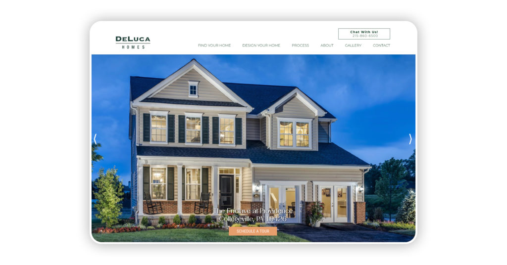
The Challenge: Make Community & Home Detail Pages Shine
While the community pages always performed well, they didn’t have a wow factor to keep users on page and clicking through to additional resources.
The Solution
We used bold, large, colorful product images to grab users’ attention and encourage them to keep scrolling. We also incorporated LotVue site maps to let readers clearly see which homes in the community are available, and intuitively click through for more information and to contact an agent. The result is a seamless experience that enables users to locate important information quickly, and get their questions answered.
The Challenge: Improve Conversion Rate
The website’s conversion rate was less than 1% — far from where they wanted it to be.
The Solution
In order to encourage more users to convert, we placed more and clearer calls to action on each page so that wherever the user is on the site, there is an obvious and easy way to request more information. A “Chat With Us!” CTA was placed on the top right of each page, and the “Schedule a Tour” CTA was placed on the home page and all community pages, the footer, and the Contact Us page. Website conversions have since increased by 150%.
The Challenge: Tastefully Showcase Multiple Awards
Deluca Homes is an award-winning company, and though it’s not something employees boast about, they are proud of the recognition. The awards are a distinction and way to build credibility and trust with customers.
The Solution
We showcased their awards by placing a graphic along the bottom of every page. It’s easily discoverable without disrupting the flow of the home search or the navigation experience.
The Challenge: Help Users Find What They’re Looking For, Faster
Previously, there were too many clicks for users to start their home search, possibly causing them to lose interest and click off the site, driving up the Bounce Rate.
The Solution
We made it super simple for users to start their home search by displaying the “Find Your Home” button as the first one in the top navigation. Website users read left to write and this is the button that typically receives the most clicks – no matter what it is.
Updating Your Home Builder Website
If your home builder website is not performing as well as you’d like, is difficult to manage on the backend, or just looks dated, give us a call or send us an email. We’d be happy to help!