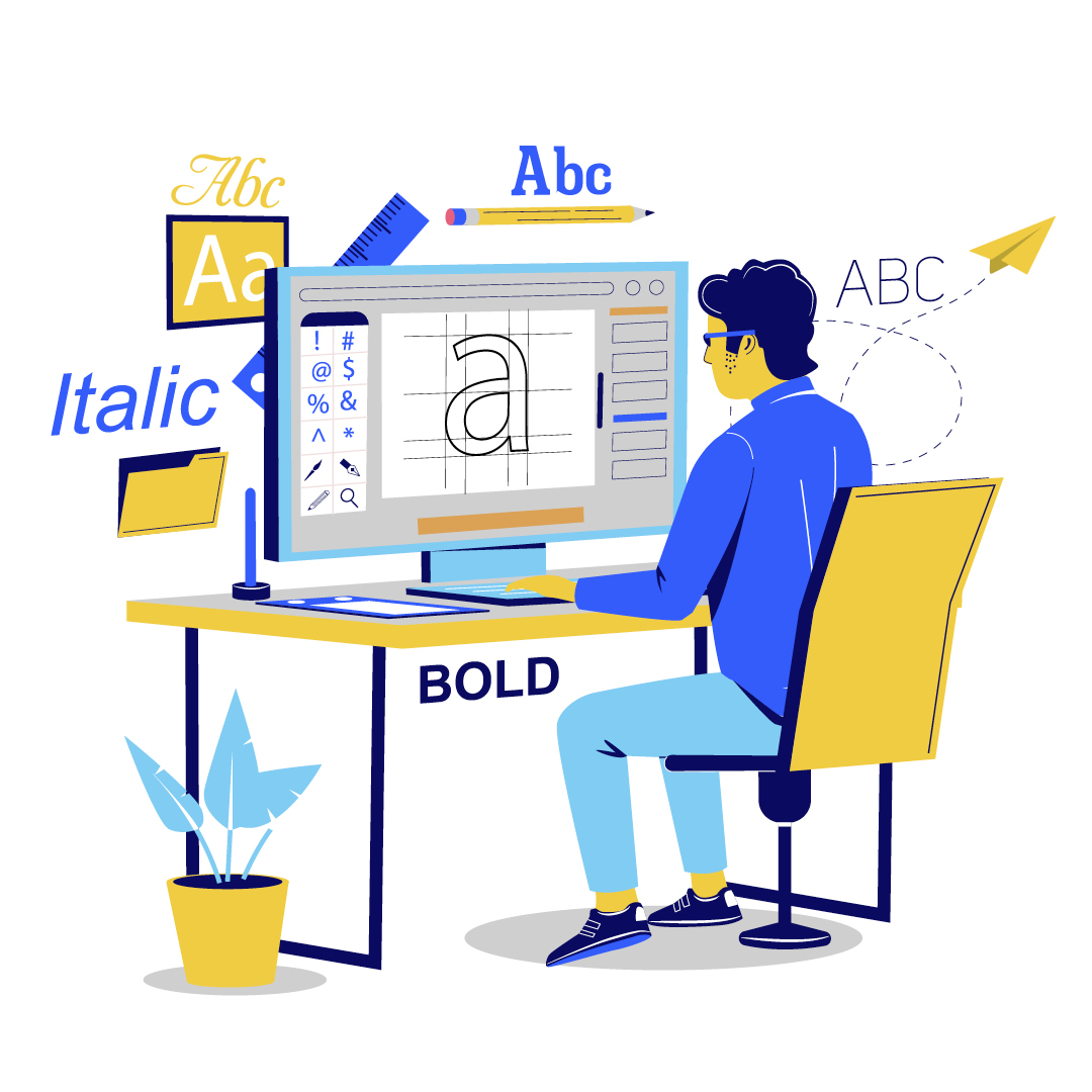
Think about an instance where you looked at a visually appealing ad, email, flyer, etc. and immediately thought to yourself: this brand has something valuable to offer. Like strong copy, exceptional graphic design doesn’t just tap into the psyche to create interest, it expresses a unique voice and personality, and highlights a singular promise.
When it comes to your graphic design, from the components of your website to your emails and banner ads, there are several rules to keep in mind to ensure the best results. You want your marketing to not only entice potential buyers, but build trust with them — and these are the most effective ways to make that happen:
1. Design with purpose
Approach every piece of visual communication for your company thoughtfully. Ask yourself what the main message is and identify the ACTION you want to happen as a result of interacting with this piece. Should the buyer schedule an appointment, RSVP, visit your website, or call the sales office? Establishing the action up front allows you to evaluate the piece on whether or not it’s going to get your desired results.
2. Use your purpose to develop hierarchy
Once you have established your purpose and main action, you can arrange the elements of your piece to signal importance.You can establish hierarchy through size, color, placement, and weight. Without keeping your primary message in mind, your piece runs the risk of becoming a collage of graphics. Everything the viewer sees should be there for a reason, and the main reason should be very clear.
3. Keep it concise
Remember, design is about using words and visuals to convey a message. Avoid using too many words when you don’t need to. If you are showing a photo of an exterior with a front porch, you don’t need to write out “front porch.” Instead, use words to connect with them emotionally — “your moments are out there” or “where nature meets the comfort of home.” Remember, all of the elements are working together, so be intentional with every word choice.
4. Design with consistency
It’s all about building trust with your buyers, so consistency in your marketing communication, from signage to your website, is essential to proving that you’re stable and credible. We recommend developing a brand guide, which dictates the primary visual DNA of your company’s branding.
5. Use a maximum of 2 different fonts (sometimes 3)
Limit yourself to your brand’s fonts (see previous recommendation for brand guide), and limit yourself to using no more than 3. That means size and weight too. If you’re using Arial Regular, Arial Bold is a second font! Your main font should be classic and easy to read, and keeping the number of fonts limited ensures your design will look professional and consistent.
6. Embrace whitespace
“Whitespace” is a term used to describe any open space without graphics or text, so whitespace can refer to open space in a design of any color. Whitespace improves legibility by giving breathing room to your visuals and messaging. Imagine every element of your design as “noise” and your goal is to get rid of as much noise as possible to allow your message to be heard. This is especially true when you’re highlighting your product, which should be given space to show your buyers what you offer without hindrance.
7. Stay within your company’s color palette
Colors should never be picked at random. Be sure to use the EXACT colors of your brand (yes, your company IS a brand). So if your brand uses red in its palette, you shouldn’t be choosing just any red, you should be choosing the EXACT shade of red that’s been established. Aside from consistency in color, color also evokes a mood. Red can mean passion, blue can spark trust, yellow can convey cheeriness. Think about the way you want your buyers to feel, and choose accordingly, as long as it’s within your available palette.
8. Maintain alignment
Everything about the placement on your design should be intentional. Graphics in your design can appear out of place if they are not aligned with purpose on your “page.” It all comes down to making sure your content is easy to digest, and not distracting or unprofessional. Maintaining alignment ensures your piece feels balanced and looks organized.
9. Use repetition
Repetition is a fundamental of design that helps strengthen the overall look, and allows you to maintain consistency. Consistency is repetition across ALL of your pieces, and repetition is repeating elements within the same piece. Repetition also allows your audience to grow familiar with your look and develop subconscious expectations. For instance, if you had two buttons in an email, they should both be treated the same.
10. Evaluate your design from the point of view of your target audience
Once you’ve completed a designed piece, look over it through the lens of your intended buyer. Imagine you know nothing about your company. Is it easy to understand from their perspective? Is the action they are supposed to take clear? And is it legible? Legibility can look different for different audiences (i.e. font size for active adults should be larger than for first-time buyers).
Whether you’re designing a graphic for social media or an entire landing page, your marketing is on a mission — not to just appeal to buyers, but to build trust with them, and show them that what you offer is what they need. With these graphic design rules in mind, you’ll create designs that make a valuable statement (and look incredible along the way, of course). More questions about graphic design for homebuilders? Reach out to the Group Two team for any of your design needs!

