A Brand Reimagined
Great builders evolve with their buyers. They evolve their products and processes to fit the needs of
the consumers in their market. The greatest builders, like Hubbell Homes, evolve their brand, too.
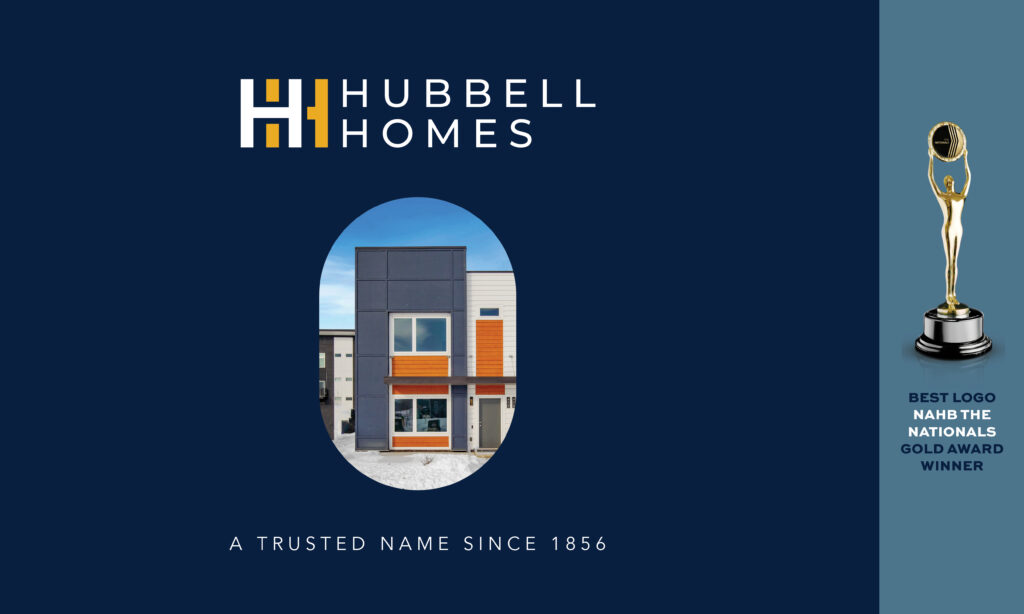
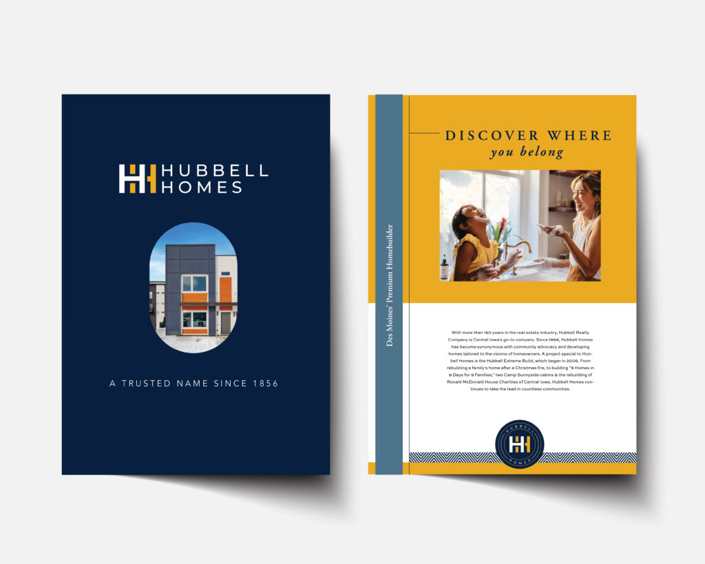
We collaborated with them to create a logo that pushes beyond their traditional look and appeal to a modern buyer. From suburban move-up buyers who expect more advanced building methods, to young professional buyers looking to live in the vibrant city of Des Moines, to active adult buyers who look to trust their builders beyond anything else — this brand identity appeals to them all.
• The interlaced H’s create a memorable and iconic shape.
• The new navy/yellow/white color palette reflects luxury at every price point. The deep navy inspires
trust, the golden yellow welcomes you in.
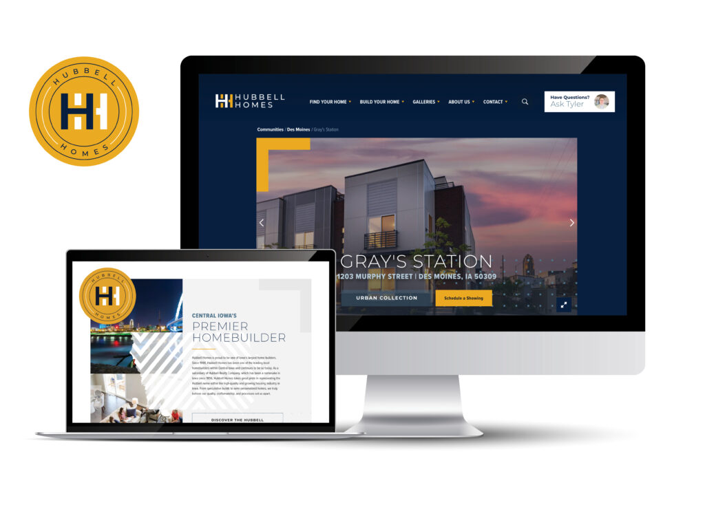
• We created a horizontal version and a round version, to be used interchangeably depending on the
application. This provides the brand with more flexibility, and the round version alludes to the
presence of an official seal or collegiate institution to appeal to highly educated buyers.
The success of the brand identity redesign can be seen across all marketing materials — a more polished, upscale look that shows who the builder truly is. What’s more, it’s reflected in this builder’s internal culture. A team of people PROUD to wear the colors, sport the logo, and come to work every day to do what they are passionate about.


Contact
1617 John F Kennedy Blvd #510
Philadelphia, PA 19103
© Group Two Advertising 2021
All Rights Reserved.